

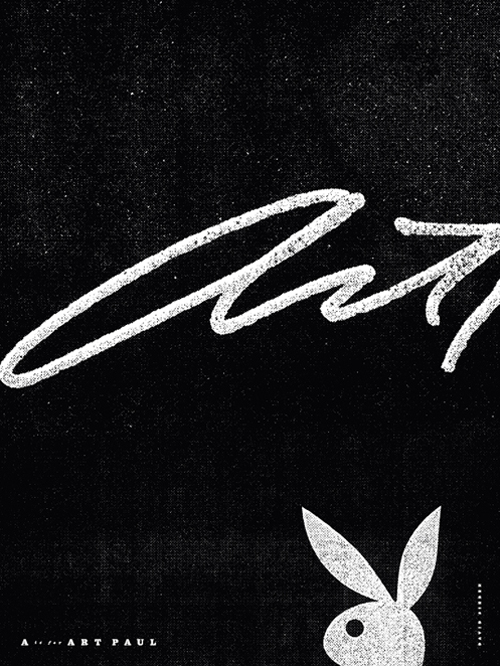
A is for Art Paul
by David Sieren
Art Paul
Art Paul is a freelance designer, art director and consultant. He is the founding Art Director for Playboy Magazine, having designed the Playboy Rabbit logo and the first issue of the magazine in 1953. After 29 years as Vice President/Art Director at Playboy he left to pursue a more diversified art and design career. He has won numerous awards and honors, including a gold medal from the City of Milano, Italy for a show of artworks commissioned for Playboy Magazine. He was a Trustee of the Museum of Contemporary Art in Chicago and named an honored alumni of the Institute of Design. In 1986 he was inducted into the Art Directors Hall of Fame. 27 Chicago Designer member 1971-1991. AIGA Chicago Fellow 2008.
David Sieren
David solves design problems, makes pictures, keeps analog creative practices alive, and teaches students both young and old to care about all of the above.
He currently leads the design discipline at One Design Company, an independent studio focused on brand strategy and experience design. In 2007 he co-founded The Post Family, an independent Chicago-based collaborative focused on creating experiences that engage communities through art and design. An adjunct faculty member within DePaul University's School of Design and a visiting instructor at Marwen, he considers engagement in the educational field to be an essential part of his practice. David currently serves as president of AIGA Chicago, the third largest chapter in the country.
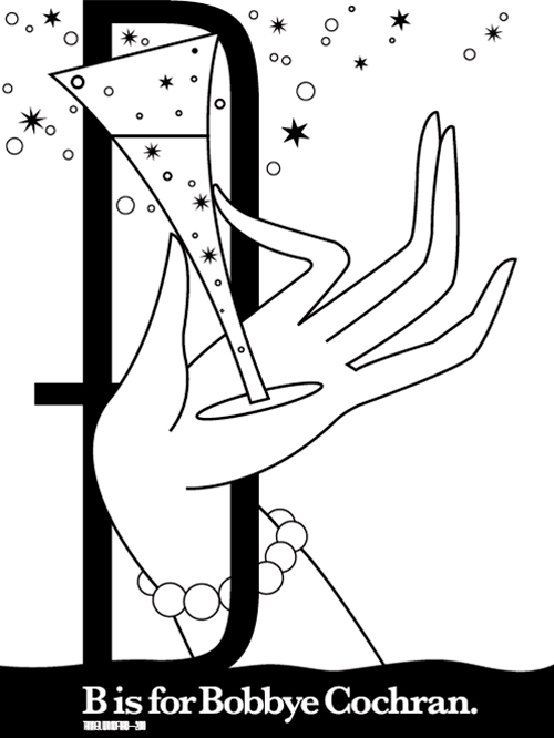
B is for Bobbye Cochran
by Tanner Woodford
Bobbye Cochran
Bobbye Cochran has expanded her design and illustration firm from a one-person operation to a six-member creative team–serving an international client list that includes AT&T, United Airlines and Anheuser Busch. Among her professional honors was Adweek Magazine's "1984 National Illustrator of the Year", making her the first woman to win this distinction since its inception. Bobbye's work has been honored by Graphis, Communication Arts, Outstanding American Illustration, New York Society of Illustrators, Women in Design Chicago, AIGA, STA and Print magazine. She has taught at Columbia College Chicago and the Art Institute of Chicago. 27 Chicago Designer member 1986-1991.
Tanner Woodford
Tanner Woodford is the founder and executive director of the Design Museum of Chicago. He teaches at the School of the Art Institute of Chicago and makes iterative work. As a designer, educator, and entrepreneur, he has taught, lectured, and led workshops on design issues, social change, and design history in classrooms and at conferences. He is happy to be scrappy, irrepressibly optimistic, and believes design has the capacity to fundamentally improve the human condition. He lives and works in Chicago.
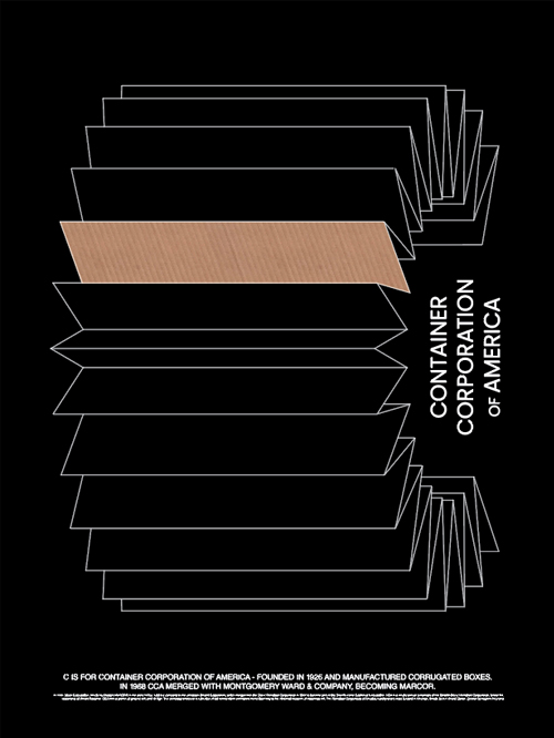
C is for Container Corp of America
by Carlos Segura
Container Corp of America
Container Corporation of America (CCA) was founded in 1926 and manufactures corrugated boxes. Under the leadership of Walter Paepcke, CCA was a patron of graphic arts and design. The company amassed an outstanding collection of art works which eventually found their way to the National Museum of American art.
Carlos Segura
Carlos Segura, founder of the Chicago-based design firm Segura Inc., came to the United States from Cuba at the age of nine. He began his career in graphic design as a production artist in Miami but soon gained more interesting challenges. He moved to Chicago in 1980 and worked for many prestigious ad agencies, including BBDO, Foote Cone & Belding, Young & Rubicam, Ketchum, and DDB.
In 1991 he founded Segura Inc. to pursue design more creatively with the goal of blending as much "fine art" into "commercial art" as he could. More of his story on The Bright Side.
Segura Inc was the beginning of a series of commercial ventures that expanded Carlos Segura's creative efforts. In 1994, the T26 Digital Type Foundry was born to explore the typographical side of the business. T26 fonts are now distributed throughout the world.
In 2004, He again ventured into a new category by launching Cartype.
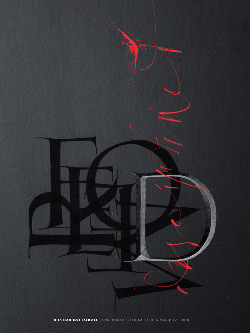
D is for Ray DaBoll
by Alicia Márquez
Ray DaBoll
Raymond F. DaBoll is one of the deans of American Calligraphers, celebrated internationally for his disciplined writing and its application to almost all forms of advertising and publishing. A graduate of the Rochester Institute of Technology, he moved to Chicago in 1912 and worked here for 40 years. 27 Chicago Designer founder: 1936-1967, Honorary Member: 1971. STA Fellow 1938, Honorary Member.
Alicia Márquez
Alicia Márquez is a letter artist who loves to use calligraphy and letter carving to express herself.
After graduating with a degree in graphic design from the University of Buenos Aires, she worked as an art director in advertising agencies and in-house design departments in Buenos Aires, Miami, and Chicago.
She has practiced calligraphy and letter carving for 10 years and recently started to explore an abstract approach using traditional techniques. She defines herself as an eternal student and intense observer, continually learning and perfecting her craft.
As an artist, Alicia thinks the journey is more important than the outcome itself, and she encourages an open interpretation and constructive criticism. As a designer, she is always looking for the clear, simple, minimalistic way to communicate. The artist and the designer in her meet every day, in every project, and usually (but not always) they get along well.

E is for Edelman Design
by Whitney Colley
Edelman Design
Edelman public relations was founded in Chicago in 1952 by former journalist Daniel J. Edelman as Daniel J. Edelman and Associates. The company started with three employees and grew to serve 25 accounts by 1960. Edelman established a second office in New York that same year and a third in Los Angeles in 1967.
Daniel Edelman, is credited with inventing the corporate media tour for his work with his previous employer, Toni Home Permanent Co. He toured the country with "The Toni Twins", a set of twins, where one used a professional salon and the other used Toni's home hair-care products. When Edelman started his own firm, Toni became Edelman's first client. Toni was followed by Sara Lee, a small cheesecake company at the time, and a bowling equipment manufacturer, Brunswick Corporation. Other clients included Vidal Sassoon, Red Cross, Cantor Fitzgerald, Royal Dutch Shell, The Church of Jesus Christ of Latter-day Saints, Starbucks, and the government of Saudi Arabia.
Whitney Colley
Whitney Colley is a designer and artist from Toronto and is currently based in Chicago. She holds a Bachelor of Design from OCADU University. Her work investigates the interrelationships between letterforms, abstraction, and legibility. Whitney experiments with typography processed through the filter of abstraction, drawing from themes surrounding surrealist imagery.
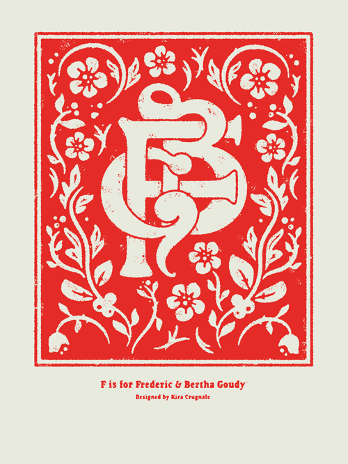
F is for Frederic & Bertha Goudy
by Kira Crugnale
Frederic & Bertha Goudy
In 1903, the Goudys founded the Village Press with Will Ransom in Oak Park, Illinois.
After teaching lettering and becoming known as an advertising designer in Chicago, Frederic W. Goudy built his reputation as a type designer. He created over 100 classic faces and was the Art Director of Lanston Monotype Company from 1920-1947. His typefaces include Copperplate Gothic, Goudy Old Style and Kennerley.
Bertha Matilda Sprinks Goudy was an American typographer, fine press printer, and co-proprietor with Frederic W. Goudy of the Village Press from 1903 until her death in 1935.
Kira Crugnale
Kira Crugnale is a Chicago-based commercial artist with a focus on design, lettering and illustration.

G is for Morton & Mille Goldscholl
by Rick Valicenti
Morton & Mille Goldscholl
Morton Goldsholl headed of Goldsholl Associates. He studied at the Art Institute of Chicago and the School of Design. His studio has been awarded over 400 citations in design and filmmaking. In He won the Package Designers Council "Industry Award of the Year", was designated "Art Director of the Year" by the National Society of Art Directors, named an Honorary Member of the Art Directors Club of Chicago and designated "Chicago Artist of the Year". He was presented with the Walter Paepcke Design Award. He was awarded Best of Show by the Artists Guild of Chicago. In 1979 he was named "Packaging Designer of the Year" by the Package Designers Council. 27 Chicago Designer member: 1950, 1963-1979. STA President 1949, Honorary Member. AIGA Chicago Fellow 2009.
Rick Valicenti
Rick Valicenti is the founder and design director of Thirst, a communication design practice providing design and immersive environments for high profile clients in the architectural, performing arts, and education communities.
His work has been exhibited at the Museum of Modern Art (MoMA), resides in the permanent collections of the Yale and Columbia University libraries, Denver Art Museum, and the Art Institute of Chicago, and has been published in The New York Times.
The White House honored Valicenti in 2011 with the Smithsonian Cooper Hewitt, National Design Award for Communication Design. In 2006, he received the AIGA (American Institute of Graphic Arts) Medal, the highest honor of the graphic design profession, for his sustained contribution to design excellence and the development of the profession.
H is for Hayward Blake
by Justin Ahrens
Hayward Blake
Hayward Blake has created numerous successful solutions to communication problems: Marketing materials, corporate identity, books, catalogs, newspapers, magazines and signage programs. Clients include Gannett Media Sales, Scott Foresman, USA Weekend, Systat, Cass Communications, Northwestern University, the Rapid City Journal, the Executive Technique, Chicago Dental Society, the College Board, Sears, Online Access, Mary and Leigh Block Gallery and the Museum of Science and Industry. Professional and personal demands involve speaking engagements, judging graphic shows, serving on boards and committees and attending workshops for continuing education. 27 Chicago Designer member 1962-1987. STA President 1959, Fellow 1966. AIGA Chicago Fellow 1999.
Justin Ahrens
For over 18 years, Justin Ahrens has led his creative firm, Rule29, in its commitment to “Making Creative Matter®” through great design and by helping others think differently about the world around them. With a collaborative approach to both strategy and design, Rule29’s culture is just as important as the work it creates; the firm is involved in many social causes, including substantial work in Africa.
Rule29 has been recognized by major competitions and publications, including AIGA where he currently serves as a National Board Member, STA, Communication Arts, Graphis, HOW, Print, The Webby Awards, and many more. Ahrens is also an author, speaker, adjunct professor and an evangelist that design can make the world a better place.
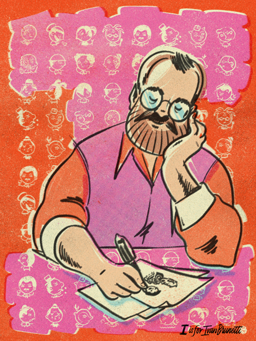
I is for Ivan Brunetti
by Kyle Letendre
Ivan Brunetti
Ivan Brunetti is a teacher, editor, illustrator, and cartoonist, usually in that order. He is the author of Cartooning: Philosophy and Practice and Aesthetics: A Memoir, as well as the editor of both volumes of An Anthology of Graphic Fiction, Cartoons, and True Stories (all from Yale University Press). His drawings occasionally appear in the New Yorker, among other publications. His most recent books are Wordplay and 3X4.
Kyle Letendre
Kyle Letendre is an independent lettering artist and illustrator based in Chicago. Since 2011, he's lettered, logo'd and drawn for clients like Instagram, Airbnb, Simon & Schuster and even a few drag queens.

J is for Jay Doblin
by Bart Crosby
Jay Doblin
Jay Doblin was an American industrial designer and past director of the Institute of Design. Doblin was a leader in industrial, product and graphic design, design management, systems thinking, and design methods. Born in Brooklyn, New York and graduating from Pratt Institute, he was an executive designer with Raymond Loewy Associates from 1942 to 1955. Serving as director and later as a teacher at ID, he shaped the curriculum to include more formal design methods and theories. Doblin founded Unimark International in 1969 and worked with clients such as Gillette, General Electric, Ford Motors, J.C. Penny, and American Airlines. He was president of the American Society of Industrial Designers and the Industrial Design Educators Association. In 1972 he founded the first strategic design planning firm in the world, Jay Doblin and Associates, later Doblin Keeley Malin Stamos, and quickly proved the revolutionary idea that design methods could help solve large-scale business challenges.
Throughout his life and writing, and particularly in his three-decade long association with the Institute of Design, he was a dedicated educator influencing thousands of designers.
Bart Crosby
Bart founded Crosby Associates in 1979. His work has been recognized by nearly every professional design organization and he has been featured in national and international design and business publications.
Bart has been an executive vice president and a director of the American Institute of Graphic Arts and is a founding member and past president of the AIGA Chicago Chapter. In 2002 he was made a fellow of the Chicago Chapter, and in 2005 he was awarded the AIGA Medal in recognition of exceptional achievements and contributions to the field of graphic design. He is also a member of Alliance Graphique Internationale.
He is a frequent lecturer at conferences and universities and has served as adjunct associate professor at the University of Illinois at Chicago.
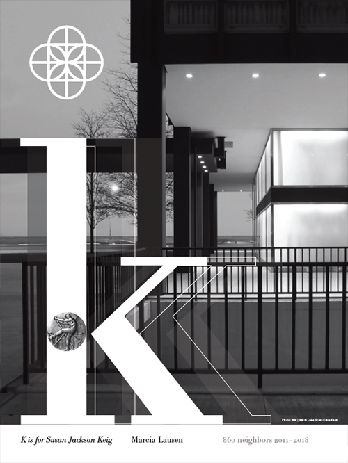
K is for Susan Jackson Keig
by Marcia Lausen
Susan Jackson Keig
Susan Jackson Keig is a graduate of the University of Kentucky. Susan has lectured at Yale University, College of the Americas Mexico, Ringling School of Art & Design, Art Institute of Chicago, Maryland Institute College of Art, University of Wisconsin and Virginia Commonwealth University. She has taught at the Institute of Design. Recipient of grants from National Endowment tor the Arts, Kentucky Arts Commission and Kentucky Humanities Council, she has had one-woman shows at the AIGA New York, J.B. Speed Art Museum Louisville, St. Mary's at Notre Dame, Ryder Gallery and Chicago Public Library. Her work has garnered over 250 awards and has been published in CA and Print. 27 Chicago Designer member 1975-1991. STA President 1955, Fellow 1964. AIGA Chicago Fellow 2002.
Marcia Lausen
Marcia Lausen is Director of the School of Design at the University of Illinois at Chicago and founder of the Chicago office of Studio/lab. At UIC Marcia leads a renown faculty of professional designers variously engaged in contemporary interdisciplinary theory and practice. At Studio/lab Marcia and her colleagues integrate four areas of communication design practice: identity, information, publication, and environment. Following the 2000 presidential election, Marcia played a leading role in Design for Democracy, a national election design reform initiative of AIGA. Her book of the same title was published in 2007 by the University of Chicago Press. Marcia was named a 2004 Fast Company Master of Design and a 2010 Fellow of AIGA. In 2015 she received the AIGA Medal.
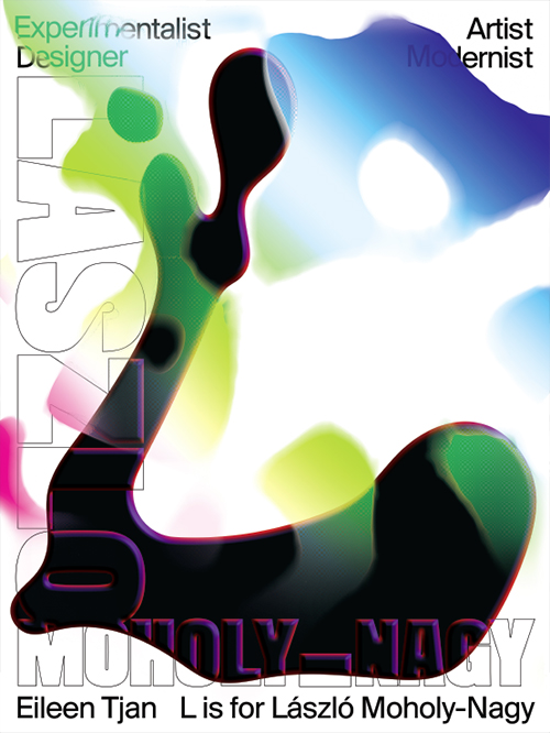
L is for László Moholy-Nagy
by Eileen Tjan
László Moholy-Nagy
A leading designer at the Bauhaus in Germany, László Moholy-Nagy founded and directed the New Bauhaus in Chicago and its ultimate successor, the Institute of Design, which became part of Illinois Tech in 1949. His commitment to the unity of art and technology made him one of the most influential art and design theorists of the first half of the twentieth century.
Eileen Tjan
Eileen is the owner and creative director of OTHER Studio, a multi-disciplinary design practice in Chicago. She is also the lead designer and co-founder of Grand Circus Magazine, a print briefing about Arts and Culture in Detroit. Before opening her own practice, Eileen worked on projects with previous employers that have been recognized by Applied Arts, Communication Arts, HOW, Type Director's Club, the Addy's, and more.
She has spoken at various design events including the Brand New Conference and Portland Design Week, as well as at universities like Columbia and SAIC in Chicago and internationally at UDEM in Mexico.
Locally, Eileen is active in the design community and enjoys hosting events, lecturing, organizing workshops, and supporting local creatives and entrepreneurs.
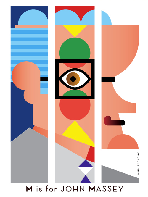
M is for John Massey
by David Lee Csicsko
John Massey
John Massey received his degree in fine arts from the University of Illinois in 1954. He was associated with Container Corporation of America as Director of Communication and as Director of the company's Center for Advanced Research in Design. John's work ranges across corporate identity, advertising, posters, paintings, prints and tapestries. His work is included in the permanent collection of the Museum of Modern Art in New York. He is a member of the Alliance Graphique Internationale; Board of Advisors of Art Center College of Design; Fellow, Rhode Island School of Design; and past member of the AIGA Board of Directors. 27 Chicago Designer member 1969-1991. STA Honorary Member. AIGA Medalist 1994, AIGA Chicago Fellow 2001.
David Lee Csicsko
David Lee Csicsko is an internationally recognized and celebrated designer and artist currently living and working in Chicago, Illinois. During his 30 year career, David has engaged in a wide variety of projects at nearly every scale; from small privately commissioned prints to to his more recent explorations of the possibilities inherent in working with stained glass and mosaics at large scales. These monumental projects have included work for hospitals, universities, elementary schools, churches, and various private homes.
While David's aesthetic and striking use of color and pattern is distinctive, each project he engages in is entirely unique. Through his work, David celebrates the diversity and richness of the human imagination, and expresses the joys of life through his dynamic use of color, bold graphics and playful patterns.
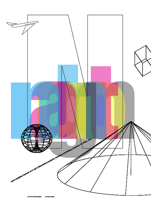
N is for Carol Naughton
by Sharon Oiga
Carol Naughton
Carol Naughton heads Carol Naughton+Associates which was established in 1975. Specializing in environmental signage and exhibit graphics programs, CN+A projects are diverse and challenging. Environmental signage programs have included airports, large retail shopping centers, corporate facilities, universities, hotels, and health care facilities. Exhibit graphics programs range from history and education to product definition and display. She has served as a director of American Center for Design, was a founding board officer of Women in Design and is a member of American Center for Design, American Institute of Graphic Arts, and the Society of Environmental Graphic Designers. 27 Chicago Designer member 1982-1991.
Sharon Oiga
Sharon Oiga is a graphic designer whose work questions and investigates the process of design—the ways in which ideas are expressed and disseminated, ranging from the micro level of experimental typographic form to the macro level of publications and self-authoring. In her role at the University of Illinois at Chicago (UIC), she teaches undergraduate and graduate courses in design, typography and thesis.
Previously, Sharon received an MFA in Graphic Design from Yale University and BFA degrees in Graphic Design and Photography from UIC. She has partnered with multidisciplinary design firms, including Studio/lab Chicago, where she specialized in identity, branding, publication design, and packaging with collaborators in the science, health, education, arts, and business sectors. Sharon's work—and her students' coursework—is consistently recognized through awards, publications, exhibitions, and funding. A two-time recipient of major funding by Sappi Ideas That Matter, Sharon was also honored to receive the student-voted UIC Silver Circle Teaching Award. She has written about her teaching in Designer Magazine, a UCDA publication.
Sharon serves as Vice Chair of the Society of Typographic Aficionados/TypeCon, as a Board Director of Chicago Design Archive, as Co-chair of STA Design Inspiration Weekend, and as a Dialogue Lead for TypeThursday Chicago.
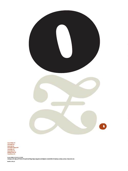
O is for Oswald Cooper
by Maria Grillo
Oswald Cooper
Oswald Cooper saw letter designers as "sad experimentists" who forever aim at the stars, forever over-shoot the mark, contrive the types we want today and will not want tomorrow." Proprietor of Bertsch & Cooper, typographers, he was not only one of the foremost typographers of his time and a prime influence on Chicago lettering and design, but a writer of wit and distinction. The Oz Cooper Book was issued as a labor of love by The Society of Typographic Arts. 27 Chicago Designer founder: 1936-1937. STA Fellow 1936.
Maria Grillo
Maria can see the forest and the trees at the same time. With logical precision and remarkable intuition, she clears the path directly to the solution. She would have been a great lumberjack. Lucky for her clients, Maria puts her big-picture perspective and problem-solving skills to work for them. She's focused, but realistic and flexible. “That makes sense. Let's try it.”
A Fellow of the American Institute of Graphic Arts, Maria's talent and achievements as a designer over the last 25 years have been recognized by some of the profession's most notable organizations and publications: Communication Arts, Graphis Poster, Print, and ID magazines, the New York Type Directors Club, and British Design and Art Direction. Maria has taught aspiring designers and peers how to plan and implement branding and design programs at the University of Illinois at Urbana–Champaign, The School of the Art Institute of Chicago, and Syracuse University's Independent Study Master of Arts Program. She has served on the AIGA/Chicago Executive Board and as juror for numerous professional and educational design competitions. She is a graduate of the University of Illinois at Urbana–Champaign.
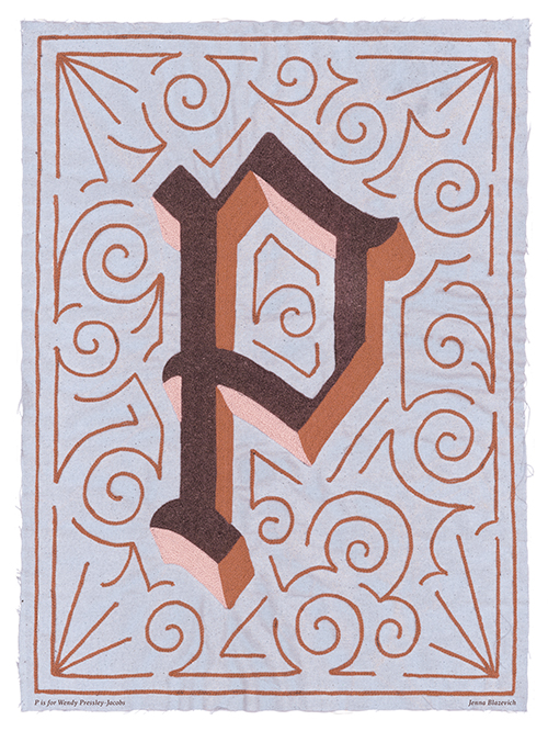
P is for Wendy Pressley-Jacobs
by Jenna Blazevich
Wendy Pressley-Jacobs
Wendy Pressley-Jacobs founded Pressley Jacobs Design in 1985. Major services include financial communications materials, corporate collateral, publications, marketing collateral, exhibitions and packaging. Prior to forming Pressley Jacobs Design, Wendy was Vice President/Design at Goldsholl Design and Film Companies; Vice President, Creative Group Director: Design Group at BursonMarsteller; and Principal Design Manager at Design Planning Group. Wendy was selected "Woman of the Year" by Women in Design/Chicago in 1991. She is a member of AIGA, American Center for Design and the Association for Professional Design Firms. 27 Chicago Designer member 1982-1991. AIGA Chicago President and Founding Member 1986, Above & Beyond 2004, Fellow 2014.
Jenna Blazevich
Vichcraft is the independent and collaborative, multi-disciplinary studio of Jenna Blazevich. Combining hand craft processes and tactile mediums with a digital design skill-set, Jenna strives to work right around the line between art and design to build a collection of activist-driven products. Her background in textiles and pattern-making continues to inform her approach as a graphic designer and feminist artist.
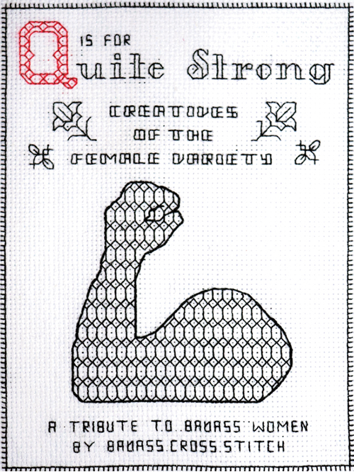
Q is for Quite Strong
by Shannon Downey
Quite Strong
Established in 2010, the Logan Square-founded collective Quite Strong was a leading force for creativity, community and innovation in design. Together, Elaine Chernov, Jana Kinsman, Victoria Pater, Jennifer Sisson and Katherine Walker created a platform that showcased amazing design, promoted up-and-coming women designers, and provided leadership and entrepreneurial advice through workshops and conferences.
Shannon Downey
Shannon Downey aka Badass Cross Stitch is a fiber artist, community builder, and general instigator. She blends her politics, activism, and art into projects that are designed to inspire others to take action, think, discuss, engage with democracy and their community, and find some digital/analog balance. She creates art to inspire other people to create art.
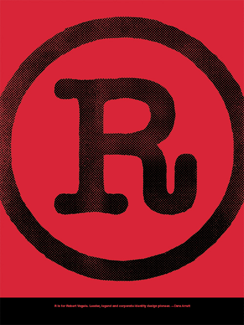
R is for Robert Vogele
by Dana Arnett
Robert Vogele
Robert Vogele was founder and chairman of RVI Corporation He launched his career in 1955 as Manager of Graphics, Packaging and Corporate Identity for Latham, Tyler, Jensen. In 1958 he started his own design consulting firm which, in 1970, became RVI Corporation. A graduate of the University of Illinois, he held a B.A. in advertising design and a M.A. in journalism and communications. Awards include New York Art Directors, Type Directors and One Show, AlGA Fifty Books of the Year and Printing for Commerce, Chicago Communicating Arts Shows, Milwaukee Art Directors, STA 100 Shows, CA Magazine, Graphis & Novum. He was Chairman of the 1978 ICOGRADA Congress held in Chicago. 27 Chicago Designer member: 1979. STA President 1979, 1989, Fellow 1978. AIGA Chicago 2005, AIGA Medalist 2011.
Dana Arnett
Dana Arnett grew up in a Midwestern town that, like his own identity, was defined as much by its modesty as its wide open expanses. As a child, he loved to draw and paint, and he vividly remembers the first time he saw "commercial art," in the pages of Communication Arts at a local art-supply store. He soon became enthralled with the work of Paul Rand, Bart Forbes, Saul Bass and legendary ad man Helmut Krone.
After high school, Arnett headed to Northern Illinois University to study visual communications. In his sophomore year, he was asked to leave the program after the faculty rejected his portfolio, taking issue with his contrarian view and love for experimentation. A week later, a group of esteemed designers from Chicago awarded his work best of show in the university's student design competition. By then, Arnett had already declared a new interdisciplinary major, "comprehensive design." In retrospect, he admits this was a blessing in disguise: The more expansive degree allowed him to take risks and develop a broader approach to design, something that would pay off years later.
At a campus lecture the following year, Arnett had his first fortuitous encounter with visionary design entrepreneur and strategist Robert (Bob) Vogele. It was the beginning of what Arnett has described as "a three- or four-year conversation that Bob was open to having whenever I was in Chicago." Through these encounters, Vogele recognized untapped passion and leadership qualities in the young Arnett, so when he conceived the idea of a next-generation design agency during the early 1980s, he brought Arnett in to help create and lead the now-venerable VSA Partners.
Arnett is a member of the Alliance Graphique Internationale and a former adjunct professor at the University of Illinois at Chicago. He has served on the boards of both AIGA (2001–2004) and the Society of Typographic Arts, and he is currently on the board of the Architecture and Design Society at the Art Institute of Chicago.
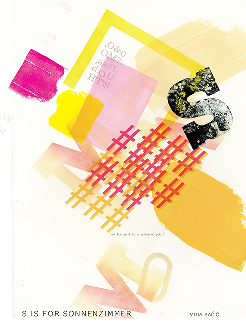
S is for Sonnenzimmer
by Vida Sačić
Sonnenzimmer
Sonnenzimmer is the collective work of artists Nick Butcher and Nadine Nakanishi. Their collaborative practice was established in 2006. Initially recognized for their idiosyncratic commissioned screen-printed posters, their practice has since morphed into an interdisciplinary toolshed spanning multiple platforms, including exhibitions, publishing, performance, graphic design, and exhibition design. Equal parts balancing act between art and design and radical reclamation of all aspects of visual expression, the studio is grounded in the lasting potential of the graphic arts, while exploring the physical and conceptual friction between abstraction and communication.
Vida Sačić
Vida Sačić is a designer, artist and educator whose work blurs the distinctions between these areas. Born and raised in Croatia, Sačić moved to the Midwest as an exchange student in her teens. She began her career by working as an Art Director in international advertising companies. In 2009, she earned an MFA from Indiana University Bloomington where she was introduced to design criticism, experimental design practices and letterpress printing.
During this time, she developed an interest in design teaching and curriculum planning for diverse student populations. She eventually accepted the position of Associate Professor of Art at Northeastern Illinois University in Chicago, where she authored and now coordinates the BFA Graphic Design program.
In addition to teachings and writing, Vida currently runs a studio in Ravenswood where she produces artwork using moveable type, creating prints, installations and animations. She actively exhibits in her home city of Chicago. Other recent exhibit venues include White Box Gallery in Portland, Oregon, DeVos Art Museum in Marquette, Michigan, Hamilton Wood Type Museum in Two Rivers, Wisconsin and The Center for Book Arts in New York City.

T is for Herb Temple
by Liz Kanter
Herb Temple
When Herbert Temple decided to pursue a career in commercial art in the 1950s, few positions were available for African-American men in corporate America.Temple was born in Gary and grew up in Evanston. He lived on the South Side of Chicago for most of his life. Temple took his first job at Container Corporation of America, designing cartons and packaging items. In 1953, he was hired by media mogul John H. Johnson as an artist for Ebony and Jet magazines. He was promoted to art director in 1967 and spent 54 years working for the company. He attended the School of the Art Institute of Chicago. He was heavily involved with the South Side Community Arts Center. "Herbert was instrumental in lending his artistic and creative insight to bring life to the pages of our publications, which ultimately inspired and informed millions of black Americans throughout his tenure," said Linda Johnson Rice, chairman of Johnson Publications.
Liz Kanter
Liz Kanter is President & Executive Creative Director of Pivot Design. Grounded in an honest and straightforward leadership style, Liz is responsible for driving all aspects of Pivot's operation. She heads the agency's account and project management, design, art direction, execution, and organization—maintaining the team's focus on partnership, and strengthening the work by simplifying. A highly accomplished creative, her design has been recognized by the Applied Arts Association, Graphis, Communication Arts, Strathmore Graphics Gallery, and HOW Magazine. She is a member of the Type Directors Club (TDC), AIGA, and the Executives Club of Chicago. Liz earned her BFA in design at The School of the Art Institute of Chicago, and continues to conduct lectures on photography, design, and self-publishing.
U is for Unimark International
by Renata Graw
Unimark International
Unimark International was a firm with global reach, with eleven offices in five different countries. Its use of the most modern design approaches and latest marketing methods quickly made it famous and unrivaled. Its clients were international corporations like Gillette, Jaguar, Ferrero, Knoll International, Olivetti, Pirelli, Ranx Xerox, Unilever, IBM, as well as American Airlines and Ford, for which it created visual corporate identities that are still in use today.
Unimark was known for always using the latest technological innovations and for using computers long before anyone else. With their visual outlook, Unimark designers had a defining influence on our environment; they left an enduring legacy with their practice and their theory. Many Unimark designers have been honored with international awards for their achievements. A distinctive hallmark of Unimark design is the systematic use of the Helvetica typeface for the corporate identity of firms.
Renata Graw
Renata Graw is the Founder and Creative Director of Normal, a small, independent team of designers and creative thinkers based in Chicago. Normal believes that thoughtful design can have a profound impact on how people interpret the world. In 2017, Normal was selected to be part of the exhibition design team for the Obama Presidential Center.Graw previously served as Vice President of AIGA Chicago, as well as a Professor of Graphic Design at the University of Illinois at Chicago.
Originally from Brazil, Graw received her BFA from the Pontificia Universidade Catolica in Rio de Janeiro and her MFA from UIC. She studied typography under Wolfgang Weingart at the Basel School of Design and participated in the ISIA/Urbino Summer Workshop under the mentorship of Karel Martens and Armand Mevis.
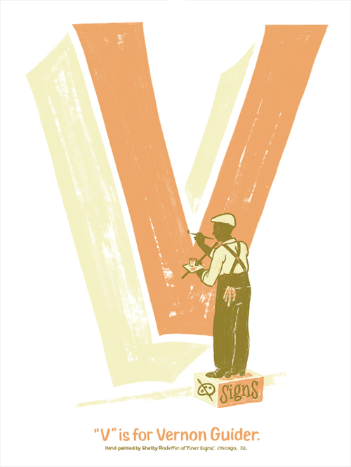
V is for Vernon Guider
by Shelby Rodeffer
Vernon Guider
Born on the south side of Memphis, Guider says it was the small blackboards in school that taught him control in lettering. "There were about 10 inches of space all around the blackboard," he explains. "I learned the alphabet on the blackboard."
His mother, Nannie Lomax, was a seamstress. His father, Will Guider, was a brick mason. The family came to Chicago in 1937 and settled in Washington Park, where the teenage Vernon found odd jobs. While working on a foundation dig, he was asked by another laborer to help paint a three-room house near 45th Place and Vincennes.
In 1945 Guider went into business with LeRoy Winbush, another Memphis native. Their studio was across the street from Phillips, on the third floor of a building at 47th and Parkway that adjoined the Regal Theatre. "When I was with him, we never had one argument," says Winbush. "We've been friends for 56 years."
Guider was befriended by his landlord, Harry Englestein, who owned the building that housed the Regal, the Savoy, and the South Center Department Store on 47th Street. He helped Guider get a contract with the Regal. Soon Guider's signs were promoting Cab Calloway, Count Basie, Ella Fitzgerald, and Jay McShann. He also did promotional movie signs for the Regal.
Perhaps his largest still-standing creation is the sign that covers the side of Queen of the Sea, the 45-year-old soul food institution on 47th Street. His understated wit hooked Mary Anderson, the now deceased original owner, who didn't even know what she wanted to call her restaurant when she hired Guider to make the sign. "'Mary's' didn't say anything," he says. "'Anderson's' didn't say anything. I asked, 'You're going to specialize in seafood? Why don't you call it 'Queen of the Sea?' She loved it."
Shelby Rodeffer
Shelby Rodeffer is a Chicago-based painter and commercial artist. Raised in Nashville, Tennessee, she embraces signs of the human hand in both personal and professional work. Her influence comes from folk art and representational art.
Shelby's most recent work deals with gender and the pursuit of real connection through the use of female figures, structures and letterforms. She is also fond of traditional sign making as a practical form of artistic expression. Currently, Shelby can be found sign painting and participating in various public art projects.

W is for Leroy Winbush
by Lisa Armstrong
Leroy Winbush
It took LeRoy Winbush 11 years to become the first black member of the Art Directors Club of Chicago, but once the organization accepted him, only five years to become its president.
Winbush moved to Chicago from Detroit as a teenager and became a graphic designer there in 1936, one week after he graduated from high school. At the time, the profession had only a few black practitioners. Winbush jumped from an apprenticeship in a sign shop to a job designing signage, murals and flyers for the Regal Theater, where he "rubbed shoulders" with performers such as Ella Fitzgerald, Louis Armstrong and Duke Ellington.
A 1958 Ebony article profiling Winbush—entitled "The Barnum of Bankers Row"—indicates how successful his business model was. Winbush "excelled at exhibit design," according to Victor Margolin, and he convinced a bank in the heart of Chicago's financial district to hire him to create window displays. Such things were unheard of in banking at the time, but Winbush Associates soon cornered the market its principal had invented, devising elaborate narrative displays with mannequins and props for 62 clients in the financial industry.
In 1959, he served as chairman of exhibits for the International Design Conference at Aspen, which he was closely involved with for eight years. Winbush also helped design Illinois's exhibit at the 1964 New York World's Fair—including its animatronic Abraham Lincoln, which was the prototype for the figures in the Hall of Presidents at Disney World.
A few years later, Winbush began teaching visual communications at the School of the Art Institute of Chicago (SAIC) and typography at Columbia College Chicago.
Although Winbush insisted that he wanted to be known as a "good designer," not a "black designer," he "believed he could use design as a tool to help the black community," says AIGA national board member Vernon Lockhart, who considered Winbush his mentor. He developed a long-term exhibition about sickle-cell anemia for the city's Museum of Science and Industry and in 1990 became an exhibition consultant to the DuSable Museum of African-American History. Winbush continued designing exhibitions for the DuSable on subjects such as the Underground Railroad and the uprising on the slave ship Amistad until he was well into his 80s.
In an interview with DeBose, Winbush acknowledged that he might not have been the only black designer fighting for unequivocal acceptance, "but I didn't know of too many others. Every place I went I was by myself." He told DeBose that he joined the ADC and the Society of Typographic Arts largely to "open the door" for other black designers.
Lisa Armstrong
Lisa Glenn Armstrong is a multidisciplinary designer and educator currently based in Chicago. She received her MFA in Motion Graphic Design from California Institute of the Arts in 2018 and her BFA in Graphic Design from DePaul University in 2012. She currently teaches in DePaul's School of Cinematic Arts.
X is for SX2
by Bud Rodecker
SX2
Essex Two is a consultancy that serves as an active conduit between ideas and people, bringing aesthetic awareness to strategic communication. Before co-founding Essex Two, in 1989, with his partner, Nancy Denney Essex, Joseph Michael Essex was senior vice president, director of design for Burson-Marsteller World Wide and director of visual communication planning for the 17 offices in the Americas. He has received hundreds of awards, from major communication publications and organizations in the United States, Europe and Asia, including medals from the New York Art Directors Club.
In 1998 AIGA Chicago presented him with its Above and Beyond Award for his extraordinary service to his profession and the organization.
His fine art and commercial posters are in museum collections throughout the world, including the Museum of Modern Art in New York City. He has lectured extensively to student and professional groups on the business of communication and his own design process.
Bud Rodecker
Bud Rodecker is a partner at Thirst, an adjunct professor at DePaul University, and president of the Society of Typographic Arts. His work explores the space between logical constraints and formal play, and balances form with meaning. He is interested in systems and processes with the potential to create design.
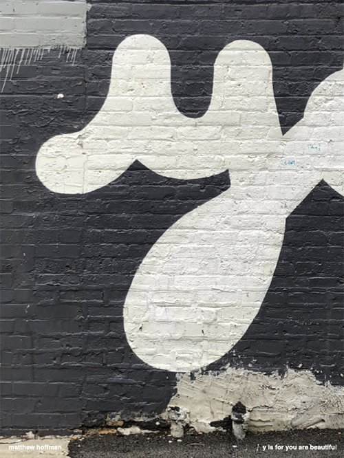
Y is for You Are Beautiful
by Matthew Hoffman
You Are Beautiful
In 2002, Matthew Hoffman printed and gave away 100 small, silver stickers with rounded corners and a simple message: You are beautiful. First spotted all over Chicago, soon enough, they spread to the coasts, across oceans and eventually, to every continent—even Antarctica. As the message became a movement, the medium evolved. You Are Beautiful has served as the centerpiece for massive murals and public installations.
Matthew Hoffman
Matthew Hoffman is a Chicago based artist & designer whose public works have been exhibited internationally. His ideas and work have been included in Good, the New York Times Magazine, and Ready Made. He has been published in books by Gestalten, Droog, and Taschen, and was featured in a segment on the Oprah network.
Matthew has created large scale public installations for the City of Chicago, Rose Fitzgerald Kennedy Greenway Conservancy, Albright Knox Gallery, as well as companies like Apple, Facebook, Zappos, & Cards Against Humanity. There are close to 30 outdoor installations currently up in the Chicagoland area.
Matthew is the Custodian of You Are Beautiful, a project to better the world in little ways. The message has reached every corner of the globe, with over 4 million stickers shared by the community. The hope is for us to share uplifting thoughts with each other.
Outside of large public works, YAB is a small but mighty team that creates art & design edition objects to interact with your daily life. These items & custom work are available directly through our online shop, as well as museum stores such as LACMA, MASS MoCA, Mattress Factory, and online at UncommonGoods.
In the Spring of 2018, Matthew is opening the first flagship You Are Beautiful Headquarters (YAB HQ) at 3368 N Elston, Chicago IL, 60618.
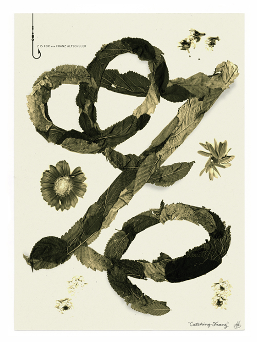
Z is for Franz Altschuler
by Adé Hogue
Franz Altschuler
Franz Altschuler attended the High School of Music and Art (NYC), Cooper Union, Institute of Design (BFA). Early work in New York. Design, illustration and art direction in Chicago. Thirty-one years in his own office. Projects include design and illustration, art direction, symbol design, exhibits, store-fixture design, point-of-sale materials, packaging, brochures, catalogs. Teaching at the Institute of Design, USAID-Venezuela. South West College, School of the Art Institute of Chicago, Columbia College, and Morehead State University, Kentucky. Awards: AlGA, Society of Illustrators, STA, Art Directors Club of New York, Chicago, Boston and Los Angeles, Typomundus, Chicago Shows, Best of Playboy. Member STA, AIGA, Old Town Triangle Association. 27 Chicago Designer member: 1957-1979.
Adé Hogue
Adé Hogue is an Art Director, Designer, and Letterer based in Chicago, IL. He has the wonderful job of using his hands to blend the beautiful with the practical. Doing more than pushing pixels, he gets to take ideas and turn them into something physical.
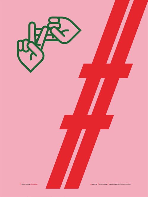
# is for Trends
by Nick Adam
Trends
The hashtag, or octothorpe, has been a major part of our extended alphabet since social media platforms adopted its use for searching just 11 years ago. Whether called hash, pound, number sign, lumberyard — the symbol traces back to Ancient Rome. Its story starts with the Latin term Libra Pondo, meaning "pound in weight." This was abbreviated to lb, which we still use. When lb became standard, it was often drawn with a little bar across the tops of both letters (℔), just to show that the l and the b were connected. As scribes started writing this sign faster and faster, lbbegan to morph.
Over time, the symbol's meaning started to bifurcate — it was used for the unit pound, and it also started to be used as a number sign. It was important enough to wind up on typewriter keyboards, which helped it survive. Fast forward to 1963. the invention of the touch tone telephone. Unlike rotary phones, touch tone phones allow you to continue to dial after the connection has been made, enabling the new telephone systems, such as automated menus. Additional buttons, they realized, could be handy in this regard. They settled on the asterisk (*) and the number, or pound sign (#), mostly because they were symbols that they knew computers would be able to recognize and were already on the standard QWERTY keyboard.
Whatever it ought to be called, Chris Messina chose to use this symbol for collating Twitter searches in 2007 because he wanted a sign that could be input from a low-tech cell phone. He had two options: octothorpe or asterisk. He chose the former.
And that is how the pound sign (or number sign, or hash mark, or octothorpe) came into ubiquity on billboards, promotional materials, protest signs, and in your annoying friend's conversations.
Nick Adam
Nick Adam is a graphic designer and ally with 15 years of experience in directing and designing across all mediums, industries, and organization sizes. His work focuses on typographic nuance and formal maneuvers to enhance the visual codes of artifacts that have a role in shaping culture. This notion is an experiential one: rich, diverse, and meaningful form can lead to rich, diverse, and meaningful life experiences.
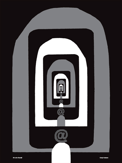
@ is for Social
by Cody Hudson
Social
Like the ampersand, the ‘@' symbol is not strictly a mark of punctuation; rather, it is a logogram or grammalogue, a shorthand for the word ‘at'. Even so, it is as much a staple of modern communication as the semicolon or exclamation mark, punctuating email addresses and announcing Twitter usernames. Unlike the ampersand, though, whose journey to the top took two millennia of steady perseverance, the at symbol's current fame is quite accidental. It can, in fact, be traced to the single stroke of a key made almost exactly four decades ago.
Before its ascent to accidental stardom, the ‘@' went almost unremarked for centuries. Widely used to mean ‘at the rate of' the symbol lived out a useful but mundane existence in the world of commerce, rarely warranting a second glance from paleographers or philologists. Even now, when it has been propelled firmly into the limelight by email's meteoric rise, credible accounts of the symbol's visual appearance and meaning remain surprisingly thin on the ground.
Once adopted as part of the increasingly standardised typewriter keyboard, the ‘@' symbol's immediate future was assured. As email (and the Internet as a whole) grew more prominent, ‘@' came to symbolise not only the Internet itself but also a sort of generic modernity, or progress.
Now, though, some years after the dot-com bubble knocked the wind out of the first wave of internet entrepreneurs, the ‘@' has once again become commonplace, and an ever-expanding roster of replacements are taking over its mantle. No longer is there a universal symbol of connectedness or modernity, and this survivor from the first days of the internet is giving way to unthreateningly generic ‘e-' and ‘i-' prefixes which owe more to marketing departments than technical innovation. The ‘@' has once again become common currency, although it can rightly claim a scope rather greater than purchase orders and grocers' chalkboards.
Cody Hudson
Cody Hudson is a Chicago based artist, also known for his graphic design contributions under the name Struggle Inc. His graphic work and paintings have been exhibited throughout the US, Europe and Japan including the Museum of Contemporary Art (Chicago), V1 (Copenhagen), Hellerau Art Center (Dresden) and Andrew Rafacz (Chicago). He is also a founding partner in the James Beard Foundation award winning Land and Sea Dept. creative group.
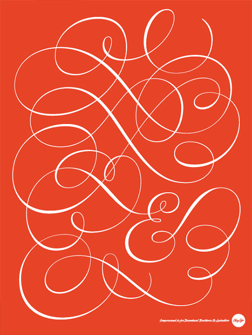
& is for Barnhart Brothers & Spindler
by Jackson Cavanaugh
Barnhart Brothers & Spindler
Barnhart Brothers & Spindler opened in Chicago as the Great Western Type Foundry. It became Barnhart Brothers & Spindler in 1883, and was acquired by ATF in 1911; it closed in 1933. Three of its typefaces in particular have had a lasting impact: the world's first grunge typeface, Fifteenth Century (released c1897 but unpopular until its rebranding as Caslon Antique around 1918); Oz Cooper's Cooper Black, sometimes seen in bright orange, 12 feet high on the side of airliners in European skies; and Caslon Openface.
Jackson Cavanaugh
Jackson Cavanaugh is a typeface designer in Chicago. For the past ten years he has run Okay Type, a small studio specializing in creating new fonts and lettering. He is best known for the typefaces Alright Sans and Harriet. Jackson enjoys researching local type and printing history and occasionally gives lectures and walking tours.
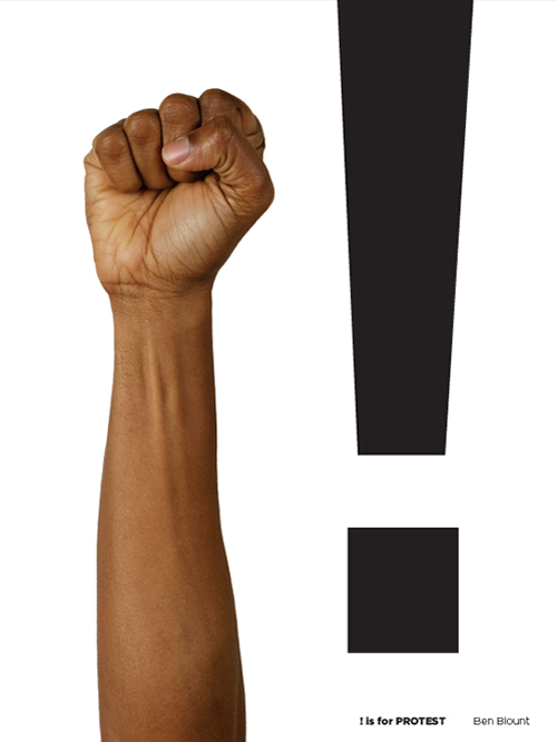
! is for Protest
by Ben Blount
Protest
In protest signs, posters, and editorial headlines, the exclamation point serves to communicate the emotions and intensity people have about society and politics.
Turns out, no one really knows the history of the punctuation mark. The current running theory is that it comes from Latin. In Latin, the exclamation of joy was io, where the i was written above the o. And, since all their letters were written as capitals, an I with an o below it looks a lot like an exclamation point.
But it wasn't until 1970 that the exclamation point had its own key on the keyboard. Before that, you had to type a period, and then use the backspace to go back and stick an apostrophe above it. When people dictated things to secretaries they would say "bang" to mark the exclamation point. Hence the interobang (?!) – a combination of a question (?) and an exclamation point (!). In the printing world, the exclamation point is called "a screamer, a gasper, a startler or a dog's cock."
Ben Blount
Ben Blount was born and raised in Detroit. He is a designer and letterpress printer that spends the best part of his work day putting ink on paper. His work explores questions of race and identity and the stories we tell ourselves about living in America. Truth tellers and rabble-rousers in all areas of popular culture inspire his work—from Dave Chapelle and Kara Walker to Mos Def and Amos Kennedy, Jr. He learned a lot about design at Washington University in St. Louis, a lot about printing at Columbia College Chicago, and filled in the gaps with compassionate mentors and lots of practice.